Radiant Discord: Lance Wyman on the ’68 Olympic Design and the Tlatelolco Massacre

It’s fascinating the way a piece of design can accrete meaning over time, as new contexts are revealed, personal stories come to light, and history slowly reifies our perceptions of an era. There are designs that, for one reason or another, transition from being simply of their time to defining their time. Lance Wyman’s identity for the 1968 Mexico Summer Olympics has been hailed as a pinnacle of branding and wayfinding, creating an unparalleled sense of space in lieu of the extravagant architecture typical of the Olympics. But it is the context it was created in and its significance as a cultural artifact that makes it a perfect case study in the accretion of meaning—and warrants a deeper analysis.
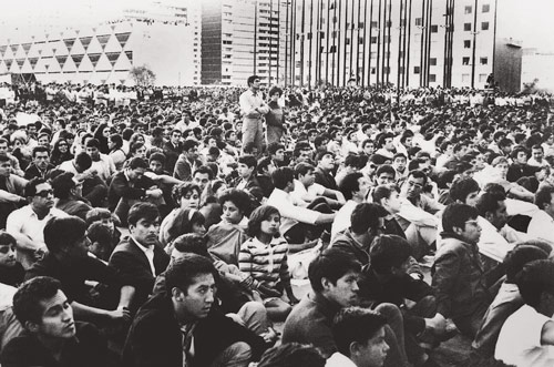
Olympic design can be complex to decode, acting as both a globalizing spectacle of peace and the epitome of nationalist propaganda. The Mexico City Olympics identity exemplifies this duality, bridging the conflicting ideologies of a nation at war with its own modernity, and for a time, its own people. 1968 was a notoriously turbulent year around the world, and Mexico was experiencing deep social unrest as students flooded the streets in protest, demanding a more transparent dialogue with the government, freedom for political prisoners, an end to corruption, and an accountability for the government’s widespread and violent repression. The thrust of this movement culminated 10 days before the opening of the Olympic Games, when 10,000 people descended upon the Plaza de las Tres Culturas in Mexico City’s Tlatelolco neighborhood for a peaceful rally. In an attempt to quell the protests, the Mexican police and soldiers surrounded the plaza, and in response to a bogus provocation organized by the government’s own Olympic Brigade, opened fire on the crowds, killing anywhere from dozens to hundreds of people, according to differing estimates. Incredibly, the Mexican government successfully concealed the magnitude of the massacre from the international community and proceeded to hold their “Games of Peace.” Even today, the Tlatelolco massacre is little known outside of Mexico.
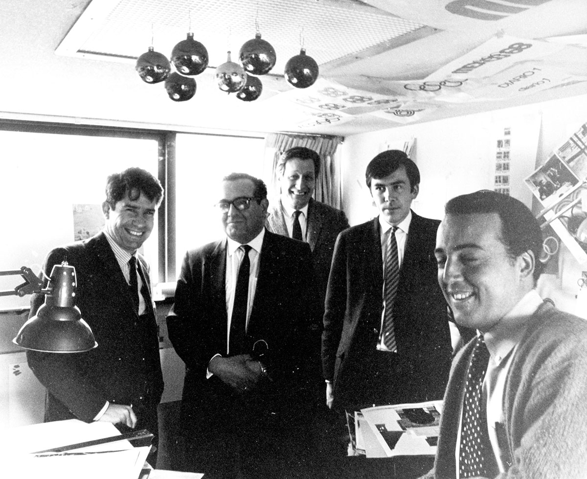
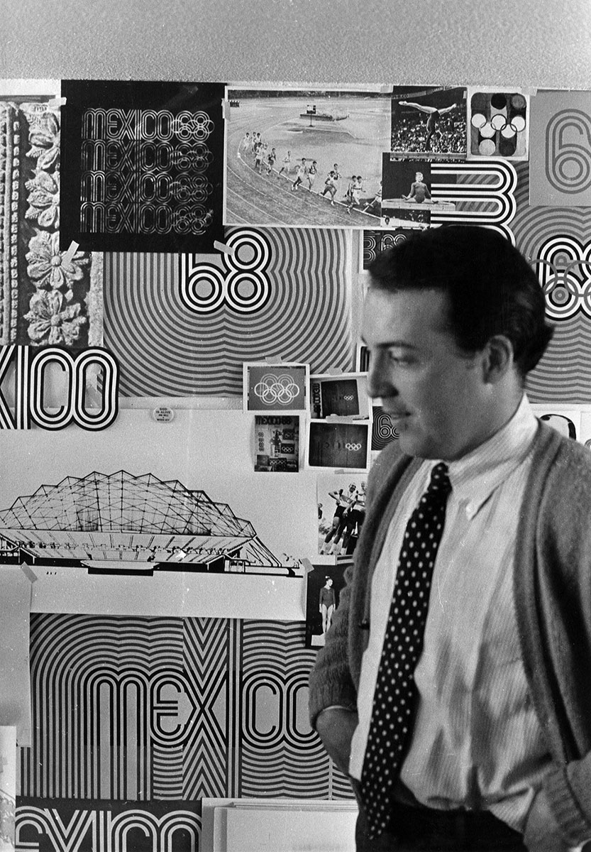
Into this somewhat intimidating context walked a 29-year-old designer with a one-way ticket to Mexico City (literally), unknowingly stepping into the center of a revolution. As the lead graphic designer for the Mexico City 1968 Olympics, Wyman would work with an international team of designers to create the event—signage expert Peter Murdoch, architect Eduardo Terrazas, publication designer Beatrice Trueblood, sculptor Mathias Goeritz,and president of the organizing committee Pedro Ramírez Vázquez, just to name a few. To supplement his talk for this year’s Insights Design Lecture Series (which you can now watch—it’s fantastic), Wyman agreed to discuss the Olympics identity: how it came to be, the cultural signifiers it contains, the ways political events surrounding the Games impacted its reading, and his feelings about the identity system nearly five decades later.
Emmet Byrne: I’d love to hear a little bit of the backstory. What exactly did the Olympic Committee task you with?
Lance Wyman: The International Olympic Committee presented us with a simple brief: create an identity that incorporated the five-ring Olympic logo and used the host country language, Spanish, as well as French and English for all publications and signs. The brief from the Mexican Olympic Committee was equally simple, coming directly from Chairman Pedro Ramírez Vázquez: “Create an image showing that the games are in Mexico that isn’t an image of a Mexican wearing a sombrero sleeping under a cactus.”
It was a daunting challenge, and in some sense, a very open-ended assignment. I traveled to Mexico with Peter Murdoch and my wife of two months, Neila, to participate in a competitive arrangement—we had two weeks to come up with something, and if we didn’t, we would go home. It didn’t help, in terms of stress, that all we could afford were one-way tickets to get down there. Peter and I worked 12 or more hours every day and stayed up all night discussing the possibilities at the Hotel Montejo in Mexico City’s Zona Rosa. Every night poor Neila had to listen to our panic as time started to run out and we hadn’t hit on anything. This was in November 1966, less than two years prior to the Games.
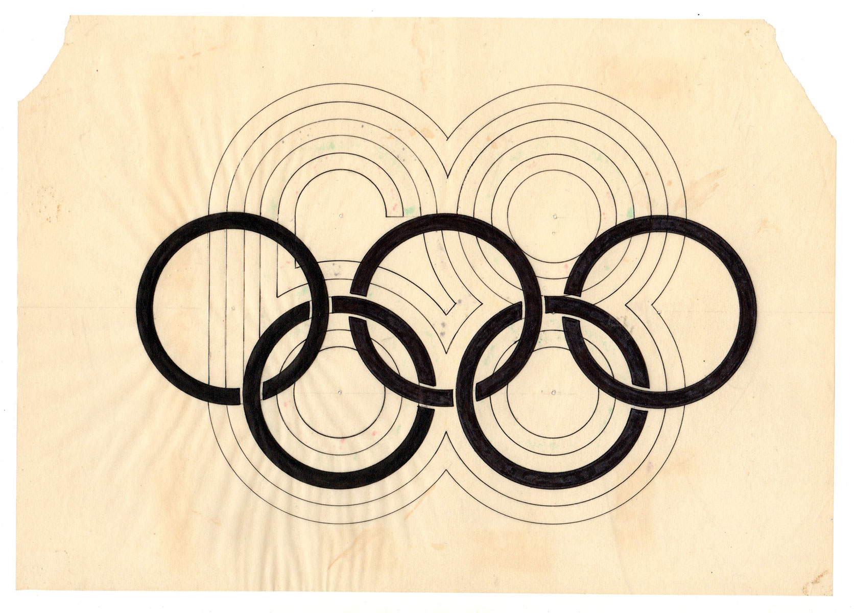
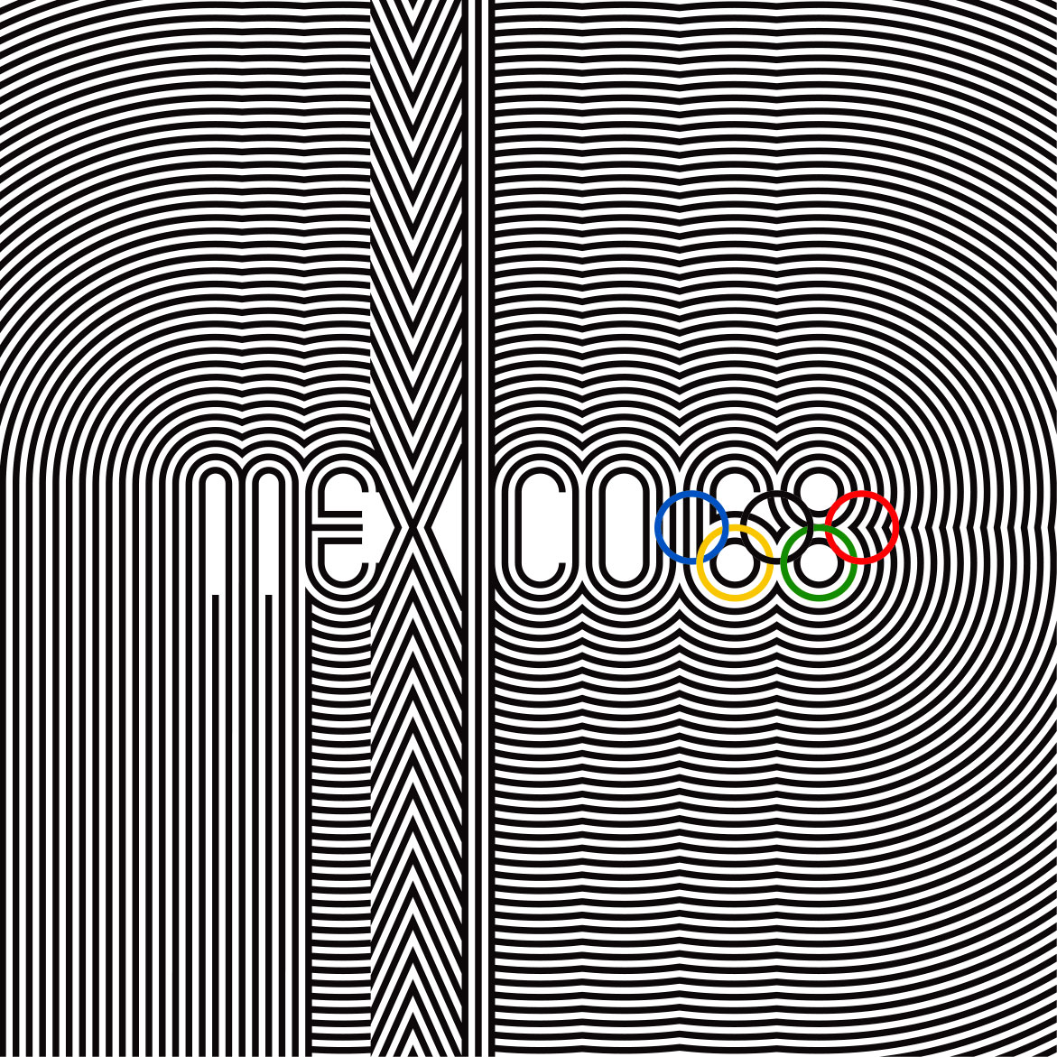
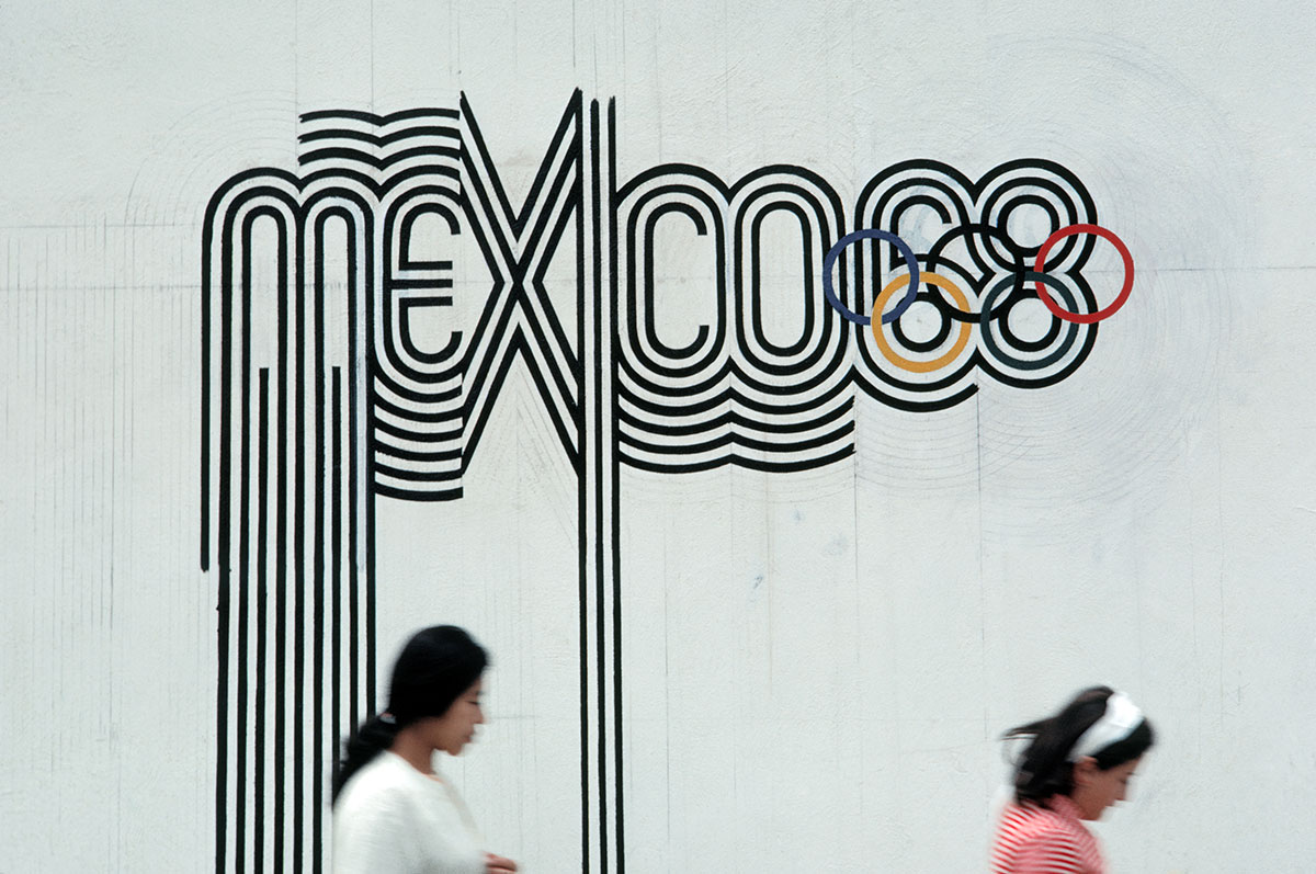
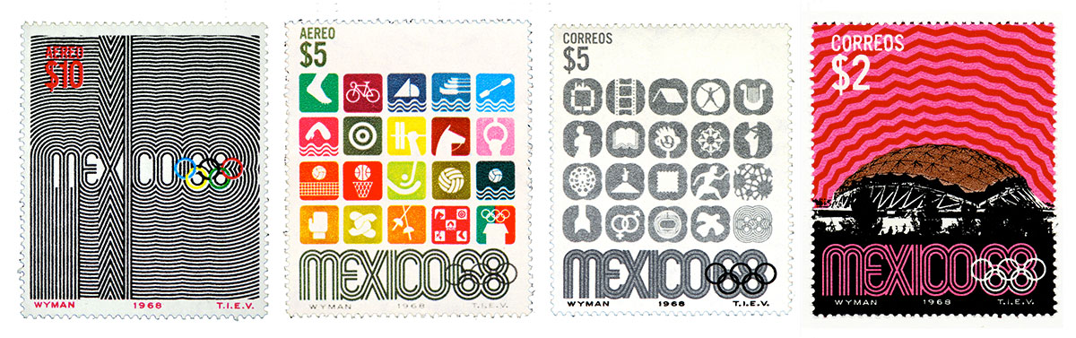
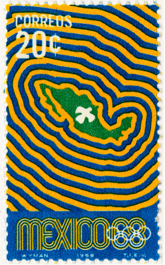
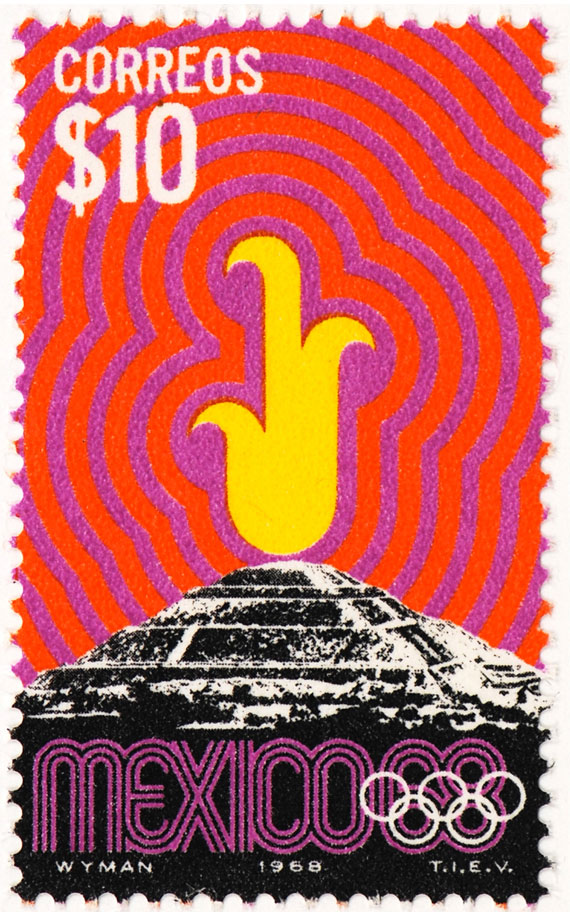
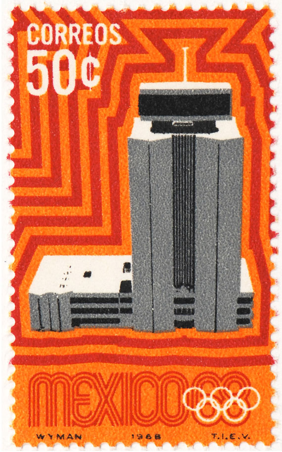
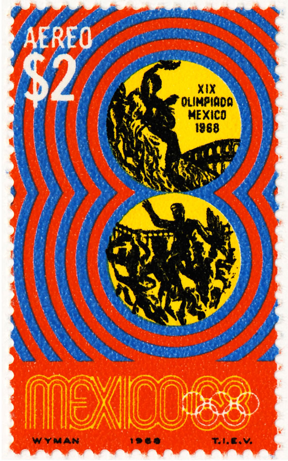
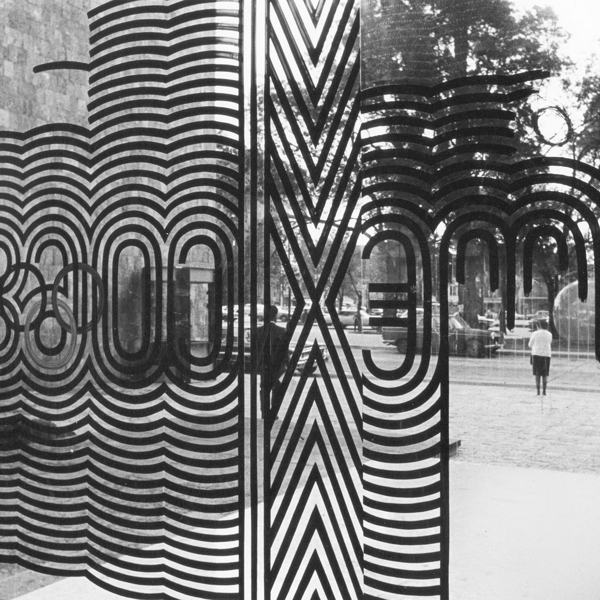
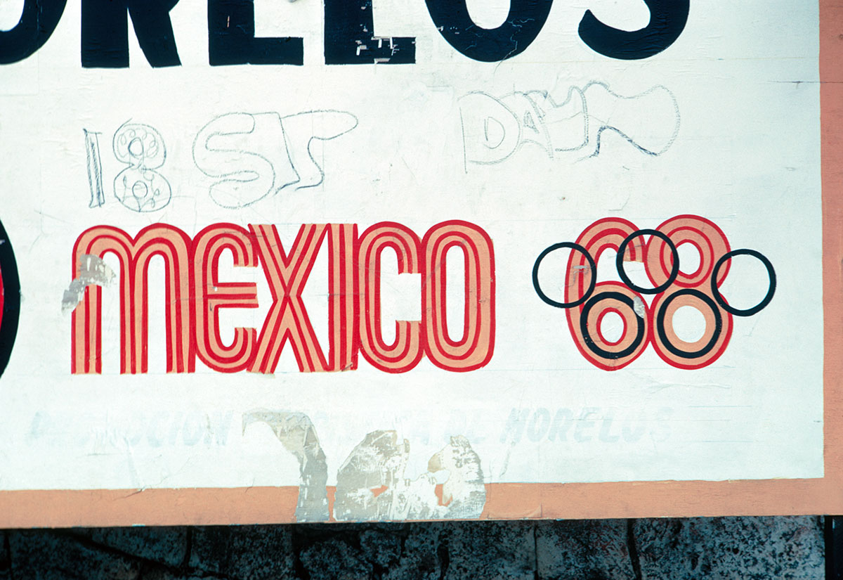
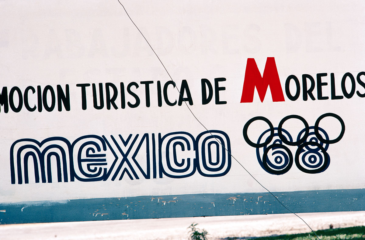
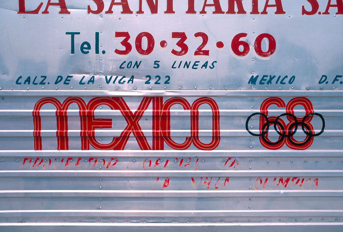
It was a great relief to finally come up with the beginning of the solution—maybe two days before the deadline—which really was based on simple geometry. The logotype happened in a very logical and intuitive way. It started when I realized the single lineal geometry of the five-ring Olympic logo could be central to constructing the number 68, the year of the event. The resulting three-line structure of the 68 numbers became the typography for the word “Mexico,” and the logo was born. It was a logo that identified the event, the place, and the year, and it probably broke every corporate rule of what not to do to the original logo ( ), but it actually made the five rings central and genesis to everything that followed. I don’t know what came first, recognizing the logical relationships in the geometry or intuitively following my nose and exploring the obvious and just letting it happen.
), but it actually made the five rings central and genesis to everything that followed. I don’t know what came first, recognizing the logical relationships in the geometry or intuitively following my nose and exploring the obvious and just letting it happen.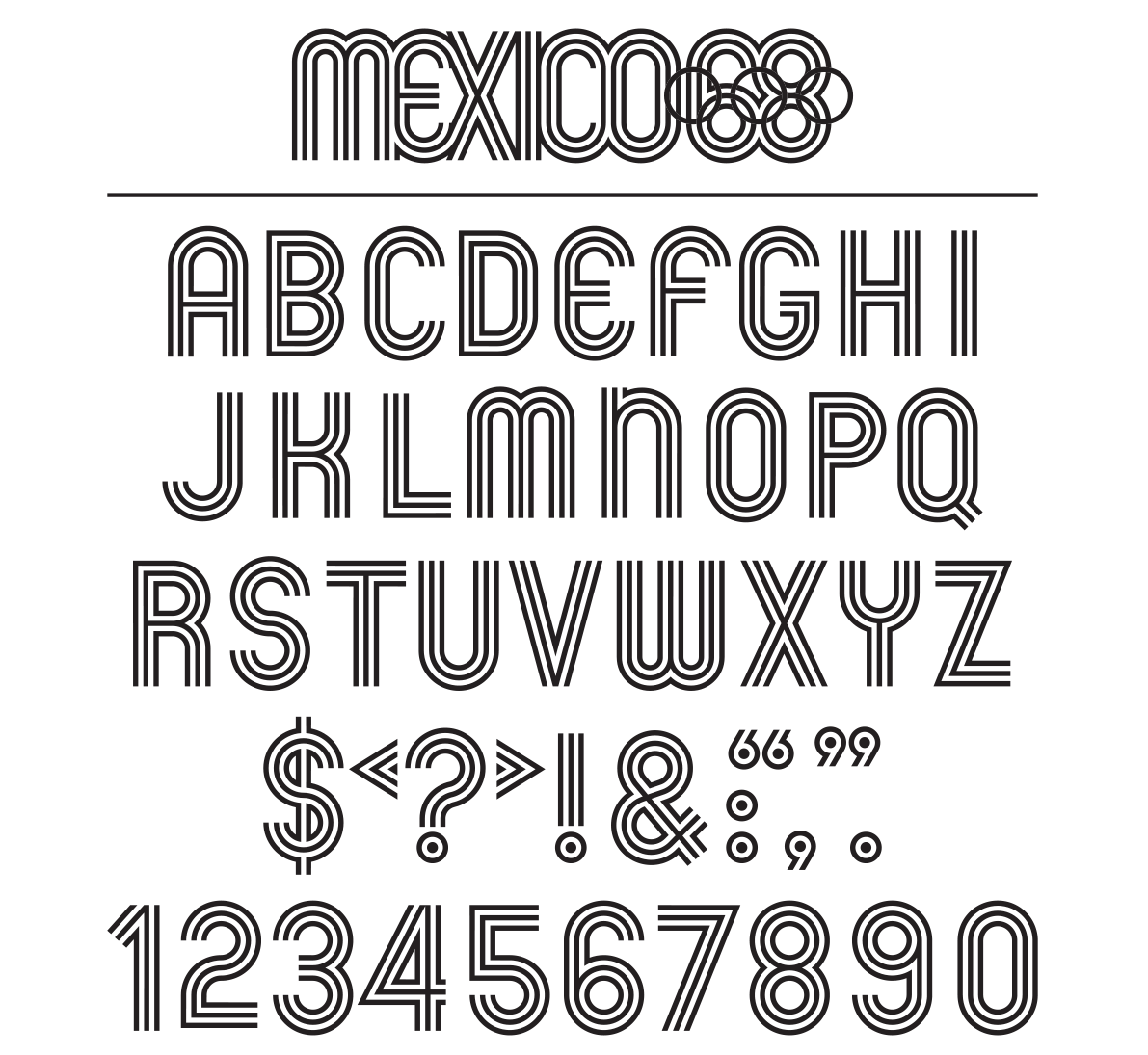
Working directly for Ramírez Vázquez, the organizing committee chair, was ideal because I could go directly to him with an idea. He was an architect and sensitive to making design decisions and a brilliant organizer. When our work began in earnest, we were able to make decisions very quickly, and everything was built to spec. I liked to consider him a “good dictator.” If it wasn’t for him, we couldn’t have achieved what we did in the short time of less than two years. I remember Otl Aicher, the designer of the 1972 Munich Games, visiting our studio and saying they were further ahead in Munich than we were. We had 18 months to go at that point, while Aicher had 18 months plus four years to go. That was frightening to hear, to say the least.
I worked on the Olympic program from November 1966 to October 1968. It was hard work with many late nights. I remember one of the Olympic Committee executives saying that our partners at home had become Olympic widows and widowers. The work was challenging and always exciting. As time went on Neila and I made friends and explored Mexico and it was a very rich life experience. As the Olympics drew near there were Embassy parties and all kinds of social happenings, and we met people we would probably never have had a chance to meet. We completely fell in love with Mexico, and came away with some great stories.
EB: When I encountered your identity in college, my first read was purely formal, based on an understanding of 1960s Op art, Bridget Riley, etc.—basically I read it as a stylistic gesture that was being actively explored at the time. The visual vibration spoke of movement, communications, ideas, with Mexico at the center and everything radiating from there. The aspirations of universal legibility in the wayfinding, symbols, and signage pointed back to the precedent of the 1964 Tokyo Olympics and the modernist agenda. It was only later that I realized that there were explicitly Mexican motifs being exploited at the same time…
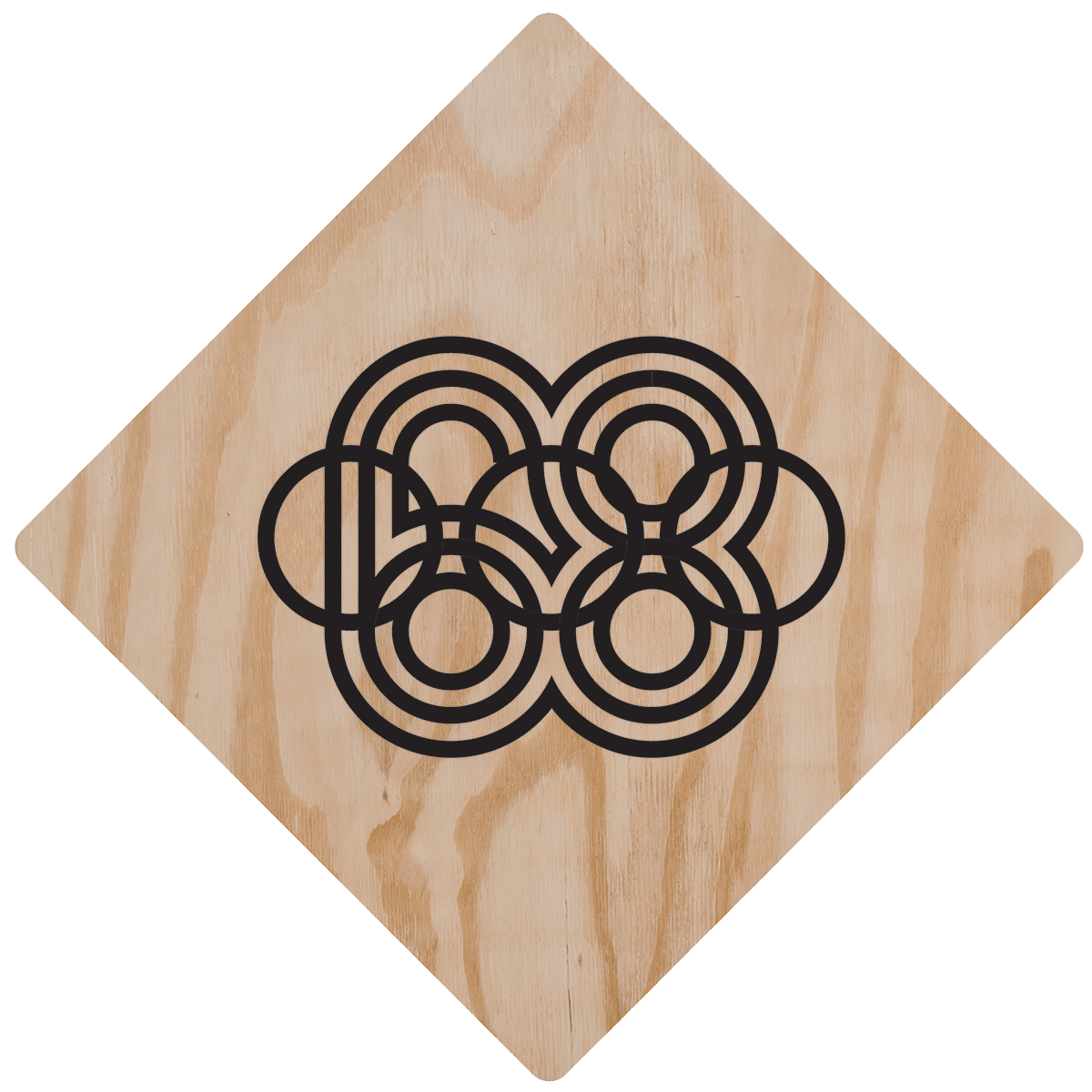
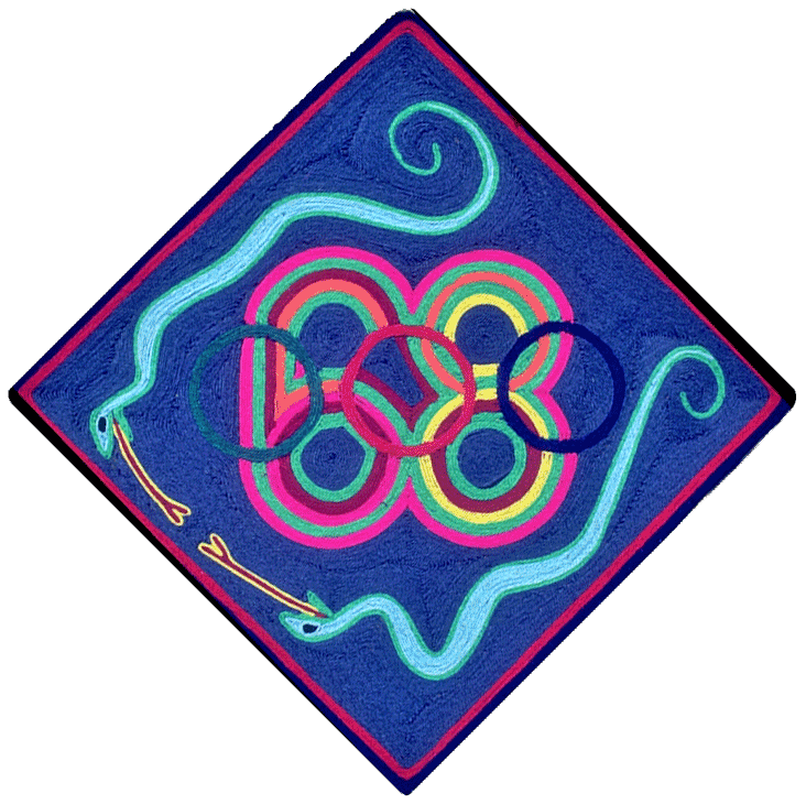
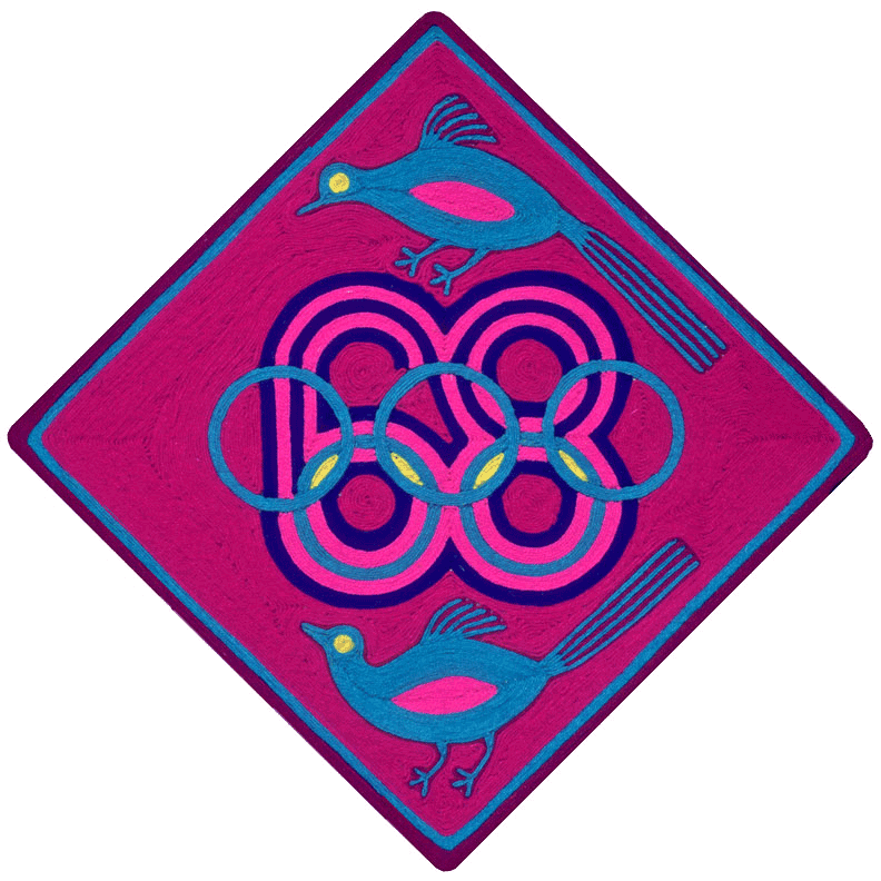
Left: plywood template; right: two nierika-style yarn paintings by Huichol artists (click to enlarge)
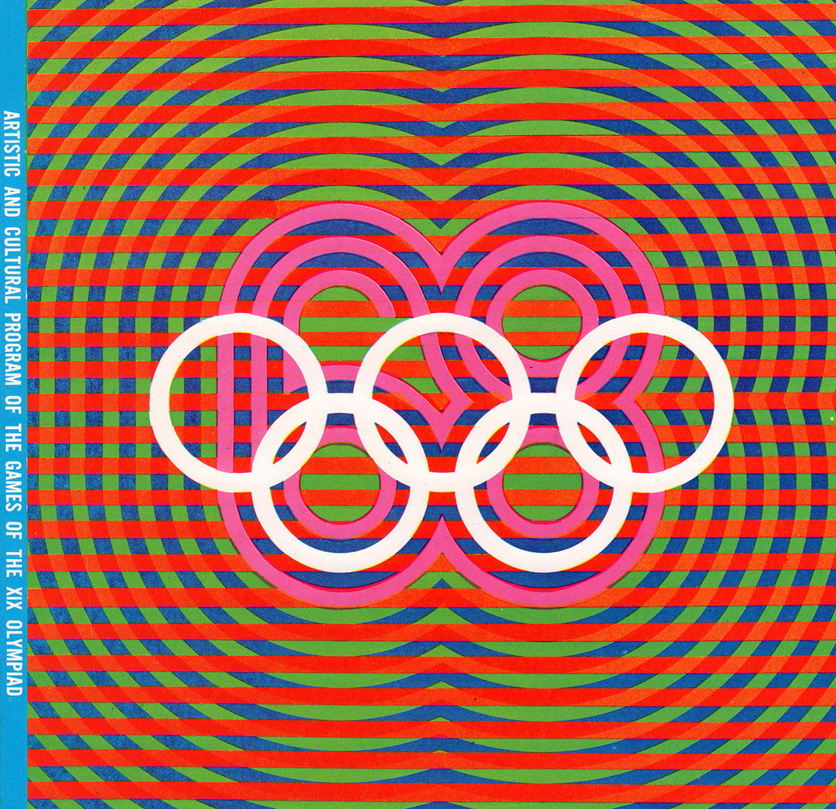
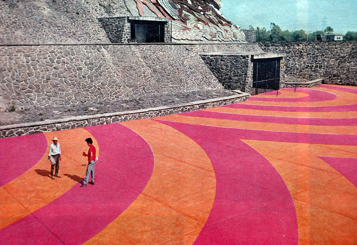
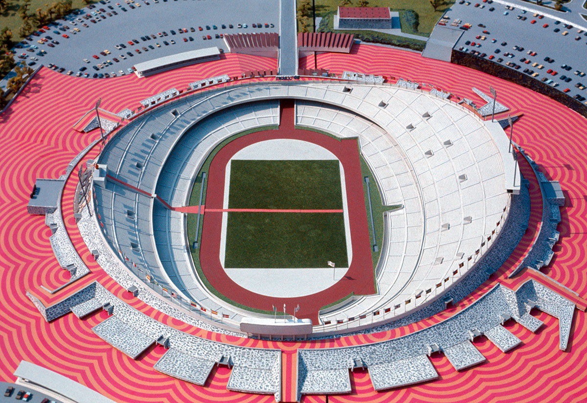
LW: That makes sense, since the genesis of the radiating lines was the geometry first. But as soon as the similarity with Huichol yarn painting became apparent, it made us realize that we really wanted to pursue graphic imagery that resonated as Mexican. We did very little research prior to going to Mexico, so the first week was spent in the Museum of Anthropology researching indigenous folk art and ancient imagery, in Mexican markets understanding their local design, and in the street taking photos of the work of local sign painters. As we proceeded, we had the opportunity to work with Huichol artists, brought in from the state of Jalisco, and learn from their unique sense of color. In one case, we made plywood square tablets (emulating traditional nierika), silkscreened the ’68 logo on them, and then gave them to the Huichol artists (see above). The artists covered these templates with wax, into which they pushed strands of colored wool, creating beautiful color illustrations of birds and other traditional imagery. We used these tablets as an aid in developing our color programing. We also referenced ancient Aztec carvings, which have a really beautiful graphic quality. I was amazed by the visual power, wit, and humor in the design I found in early Mexican cultures. It influenced my Olympic work, my Mexico City Metro work, and most of everything I’ve done since. Their examples of vibrating color, the prevalent Op art of that period, and the bold expressive geometry found in many of the early Mexican cultures all contributed to the look of the overall design program.
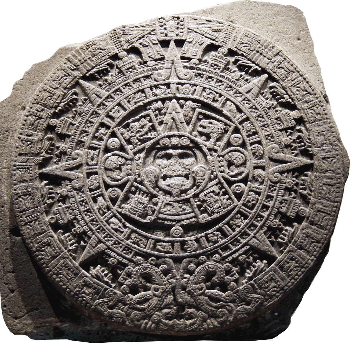
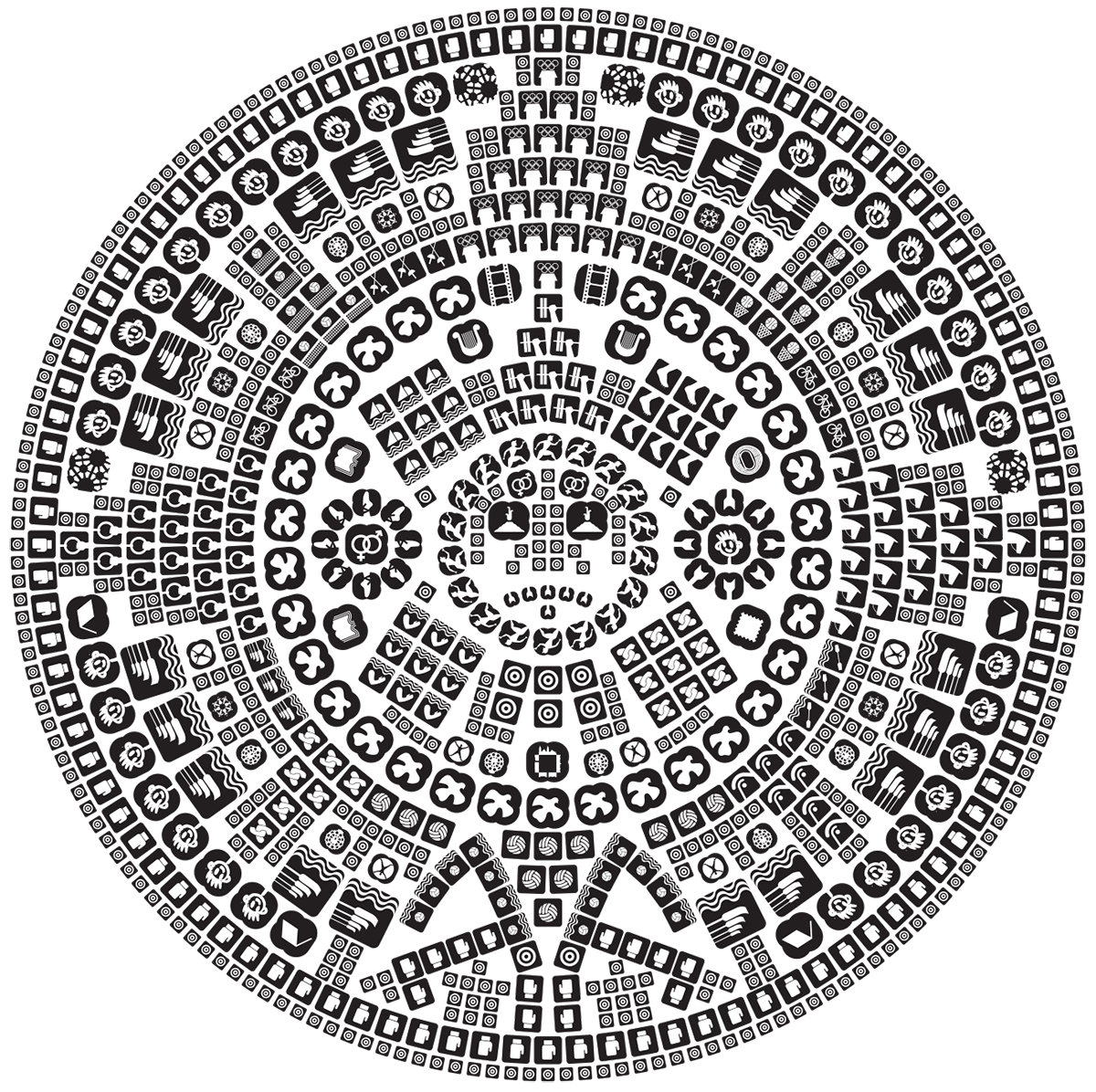
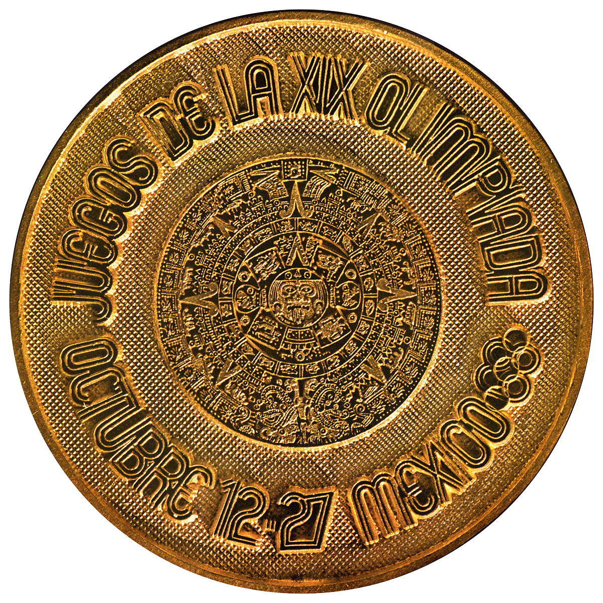
From top to bottom: Aztec carving, Aztec sundial created from Olympic symbols, Olympic coin (click to enlarge)
EB: I find it fascinating the way three different ideologies seem to be colliding in this one system, some of which is intentional on your part and some of which is only revealed in hindsight, through the accretion of meaning; and the way that form, in this case the abstract form of the radiating lines, can accommodate all this. On one hand you have the modernist, international style, the quest for universal legibility and the base geometry that embraces mechanized production. In this context, the radiating lines speak to mass communication in the industrialized age, the idea of Mexico transmitting itself to the world. From here, you upend that universality with culturally specific signifiers, utilizing traditional Mexican motifs, ancient and spiritual ideas—simulating a coherent sense of national pride, even as it reflects the mashup of cultures that is modern Mexico—the indigenous, the colonial, and the modern mestizo independent state—the three groups celebrated by the fateful Plaza de las Tres Culturas. Incorporating local vernacular into design work can often feel like an exercise in perpetuating clichés, but the radiating lines resist that again through abstraction, refusing to be hackneyed stereotypes. And when we explore the origins of the particular motifs—the Huichol nierika, for example—the spiritual context almost seems subversive. Within these prayer mandalas, which are seen as portals to the spiritual world, the radiating lines are said to represent a living thing’s communication with the deities, panpsychic emanations from a shaman’s peyote-induced visions.
LW: (Laughs) Well, I’ve often been accused of being on peyote, but it was something I never did.
EB: Yes, I can’t imagine the IOC responding well to a peyote-inspired identity, but honestly the druggy reference doesn’t feel incongruous to me. It feeds into my next read of your identity—the meaning that has accreted through time—which is how your identity serves as a visualization of the pure agitation of 1968. It’s simply hard to untangle your identity from the background of that year. The psychedelic op-art embodies that frenetic time, bringing to mind the exploration of perception through art and chemistry, the counterculture, and for me (as someone who didn’t live through the period and can only comprehend it as history), the politics: the global disruption of the student movements in France, the US, Poland, the Czech Republic, Brazil, Germany, and of course, Mexico. But that’s me, looking back and projecting on to your work. What was it like for you, being in Mexico City during the protests and the massacre of 1968? How did you feel about working for the Mexican government at that time?
LW: It was very tense. I wasn’t much older than the students at that time, and I related to them deeply. The Tlatelolco Massacre was a tragedy, and I remember very well that week before the games began. I felt torn between wanting the Games to not be cancelled by the violence and wanting to support the students. I was working for the Olympic Committee, which mostly downplayed the significance of the violence. And even though it felt like the massacre was being swept under the rug internationally, it was impossible to avoid in Mexico City, with stories coming in from friends and, of course, from my wife Neila, who saw tanks in the streets. One prevailing feeling I remember was the horror that students were being killed but we didn’t have a sense of what the scale of the uprising was at that time. It was a scary day-to-day experience. We didn’t know if the Games would be stopped, there were grenadaros in the streets, and I was concerned for my wife’s safety. I remember the celebration at the Olympic Committee when we realized that the Games would proceed, and a deep sadness for the students.
I would have to say that I felt dirty.
EB: The student protests and the government’s disproportionate response provides another read of your identity, based on an understanding of the Olympics as an unstoppable behemoth of peace that descends upon a nation every two years and demands perfection. In her essay “Unstable Ground: The 1968 Mexico City Student Protests,” Mary Shi writes, “When the International Olympic Committee granted the Mexican delegation the Olympic bid in 1963, it was not simply granting Mexico the honor of hosting an international sporting event; it was also affirming Mexico’s place on the international stage as a ‘modern country.’ Granting Mexico its bid for the 1968 Olympics was a performative act on a grand scale.” Your graphic identity can be understood as an extension of this performance, blanketing the city with a bold image of a modern Mexico, while many of its citizens fought to dismantle this very image. Shi continues, “The international community had hailed Mexico as the paragon of ‘from revolution to stability.’ … After the developed Euro-American world formally acknowledged Mexico’s progress in affirming its Olympic bid, the Mexican elite would spare no expense to confirm their nation’s modernity. As the Olympic organizers self-consciously acknowledged in one of their many mottos, they were ‘before the eyes of the world.’”
Where Japan had succeeded four years earlier in projecting an image of a nation shedding its imperial past for a modern future, Mexico was performing an equally aspirational exercise of reinvention but in a much more hybrid way. Mexico’s performance was envisioned as less a clean break with the past, and more the harmonious culmination of the modern mestizaje identity. Within this self-fulfilling prophecy, your Olympic identity is firmly aligned with the dominant voice of the Mexican government (which Shi also points out in turn was trying to live up to an equally dominating international system). It’s no surprise then, that one of the protest strategies the students used was the appropriation of your identity, acts of graphic detournement that sought to expose the hypocrisy of the Olympic slogan, “Everything is possible with peace.” What was your response to seeing your identity used for this purpose?
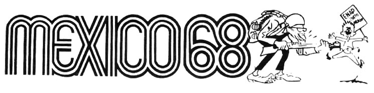
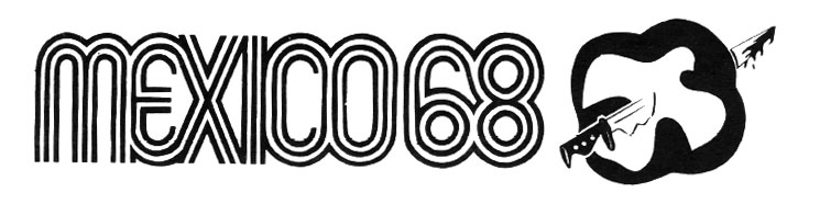
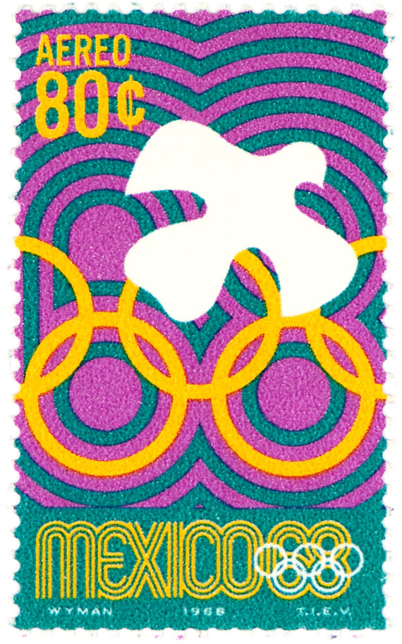
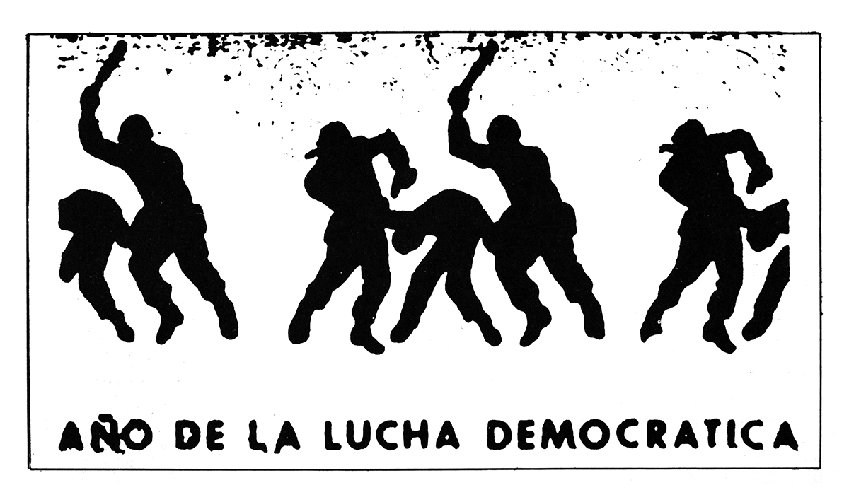
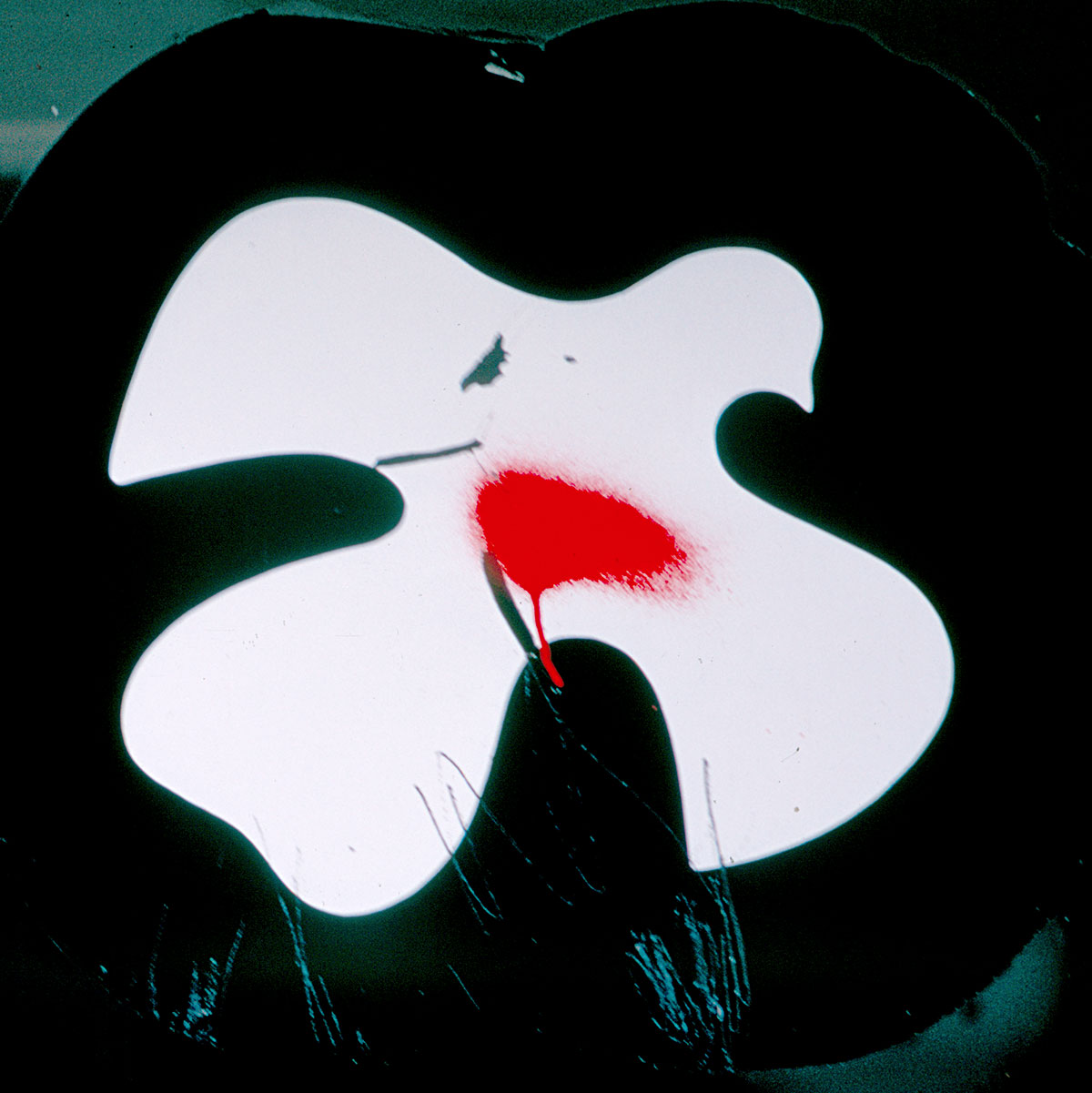
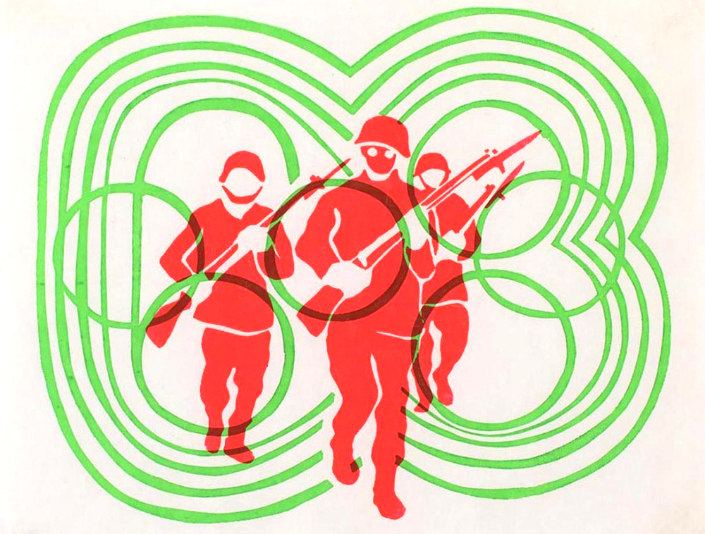
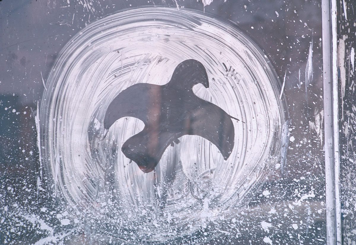
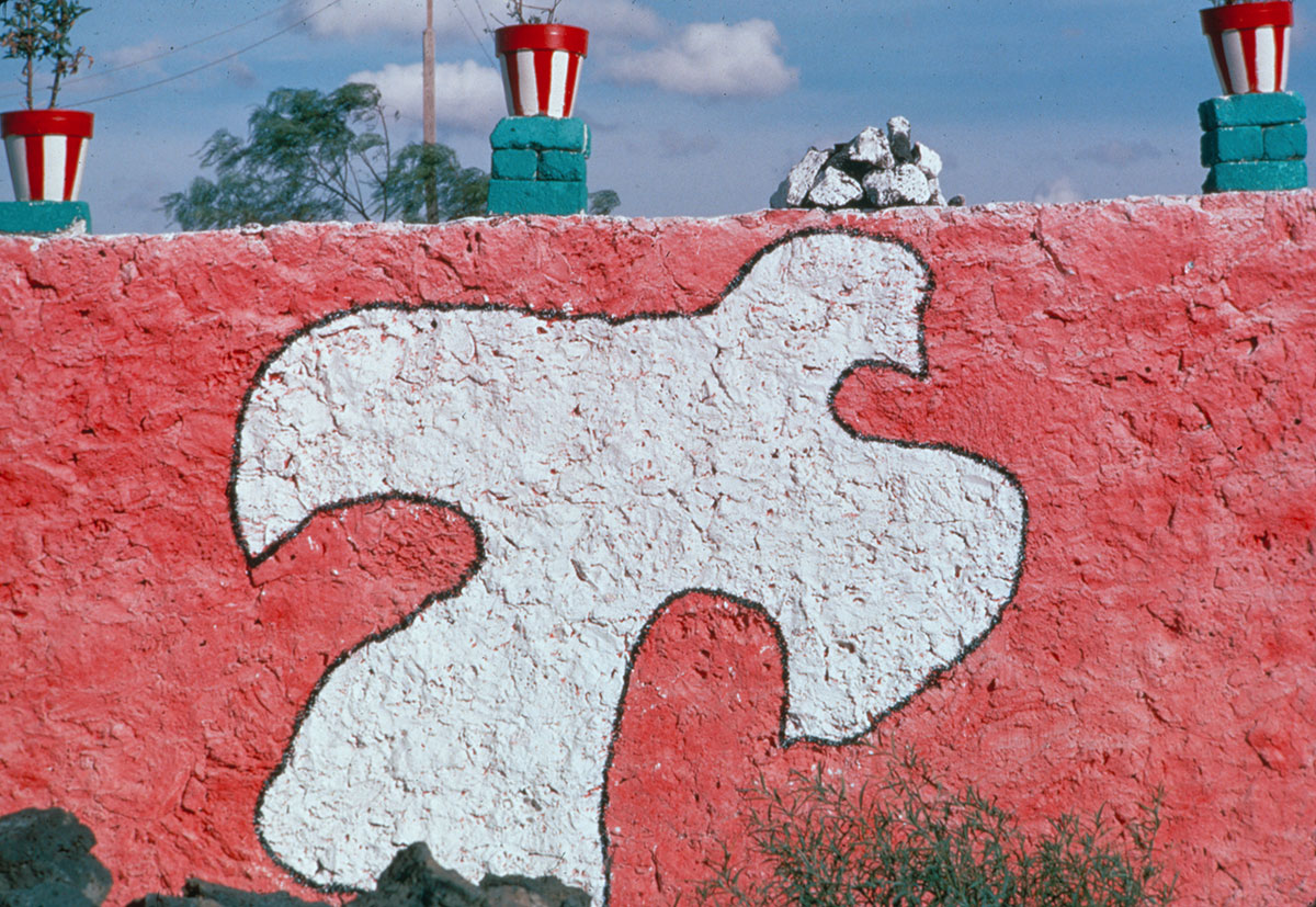
LW: It was intense to witness. The students subverted our identity in such powerful ways. They used the ’68 logo freely and attached it to revolutionary images, such as an image of a policeman as a gorilla. They riffed off of our silhouette system, specifically my postage-stamp designs, switching images of athletes for images of protestors being beaten by the police. And they even replaced our sporting event symbols with images of grenades, gas masks, bayonets, boots, and bombs. But the most powerful subversion I saw was a response to the dove symbol that we created to represent the World Peace cultural program. Shop owners throughout the city were given decals of the dove symbol ( ) to put on their storefront windows. The students would walk by and spray a red spot on the white dove and let the red paint drip down the decal. It was an effective image of the violence of the uprising.
) to put on their storefront windows. The students would walk by and spray a red spot on the white dove and let the red paint drip down the decal. It was an effective image of the violence of the uprising.
I was lucky enough to have a bit of closure to the whole experience, when years later in 1986 I was invited back to give a design lecture at UNAM, the National Autonomous University of Mexico. After my talk, the rector of the design school formally presented me with a book called La Grafica Del ’68, featuring the anti-government graphics designed by the students for the uprising. He publicly thanked me for creating a graphic language for the Olympics that they transformed into protest posters and other public images. He himself was one of the student protestors in ’68. Even now when I remember this moment I feel flooded with emotion—it was a surprisingly strong reaction. It felt like a cleansing when he gave me that book. Again, “dirty” was a real feeling—and it felt lifted.
EB: That’s a really beautiful moment, and it seems to revolve around a revealing contradiction. As a former student protestor, why was the rector thanking you for creating the same identity that he worked so hard to subvert decades ago?
LW: That’s a good question, and I don’t have a simple answer. At the Olympic Committee we were all working very hard to make the Olympics successful, which felt very important for the future of Mexico, regardless of politics. I believe in the Olympics, and I think the purpose of the ancient games was to come together in peace, to put down arms and have a friendly sports competition. Whether that was ever really accomplished I don’t know, but I still like the thought. As the stories of students being killed became a horrible reality, working for the Olympic Committee became a very bittersweet experience. I could have walked away from the program when we started to realize the reality of the violence. It was a complicated place to be caught between. When the rector presented me with the book, I realized that I was incredibly proud of my work for the Olympic Committee, and also proud that the graphics were seen as giving the students a visual vocabulary to speak through, or speak against.
EB: In a speech to students a year after the massacre, Javier Barros Sierra, the dean of UNAM, would proclaim “Long live discrepancy!”—calling for a renewal of what he saw as an autonomous university’s purpose: to foster disagreement within culture and society. He called for students and artists to embrace the conversations that seemed irreconcilable, to demand democratic protest, and to act as a foil to the government’s suppression of resistance. In their exhibition, The Age of Discrepancies, curators Olivier Debroise and Cuauhtémoc Medina would frame the trajectory of Mexican art of the late 20th century in the context of Sierra’s proclamation, articulating an age defined by deliberate creative dissent in the wake of 1968. Their idea might serve as my final interpretation of your identity as well: discrepancy. Or, searching for peace while embracing the vibration of discord.
This could be a conversation debating the idea of a designer’s complicity, but that suggests a passive relationship between the designer and the forces that shape our surroundings—a simplistic choice between the binary of engaging or not engaging. The idea of discrepancy seems more desirable, and would designate the designer as the interpreter of meaning, existing between conflicting ideologies, tasked with understanding and arranging these ideas into dialogue, and even dismantling them, if necessary. The Olympics are a salient example of something nations, as imagined communities, are constantly doing: reinventing themselves through both aspirational invention and duplicitous fabrication. You were working in a moment that was defined by discrepancies, between contradictory ideas that refused to resolve themselves neatly, and I think you found an honest way to celebrate just that very thought.
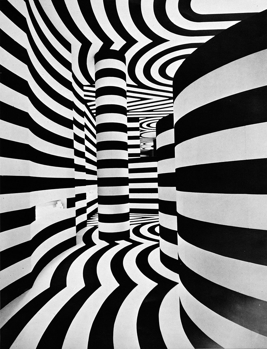
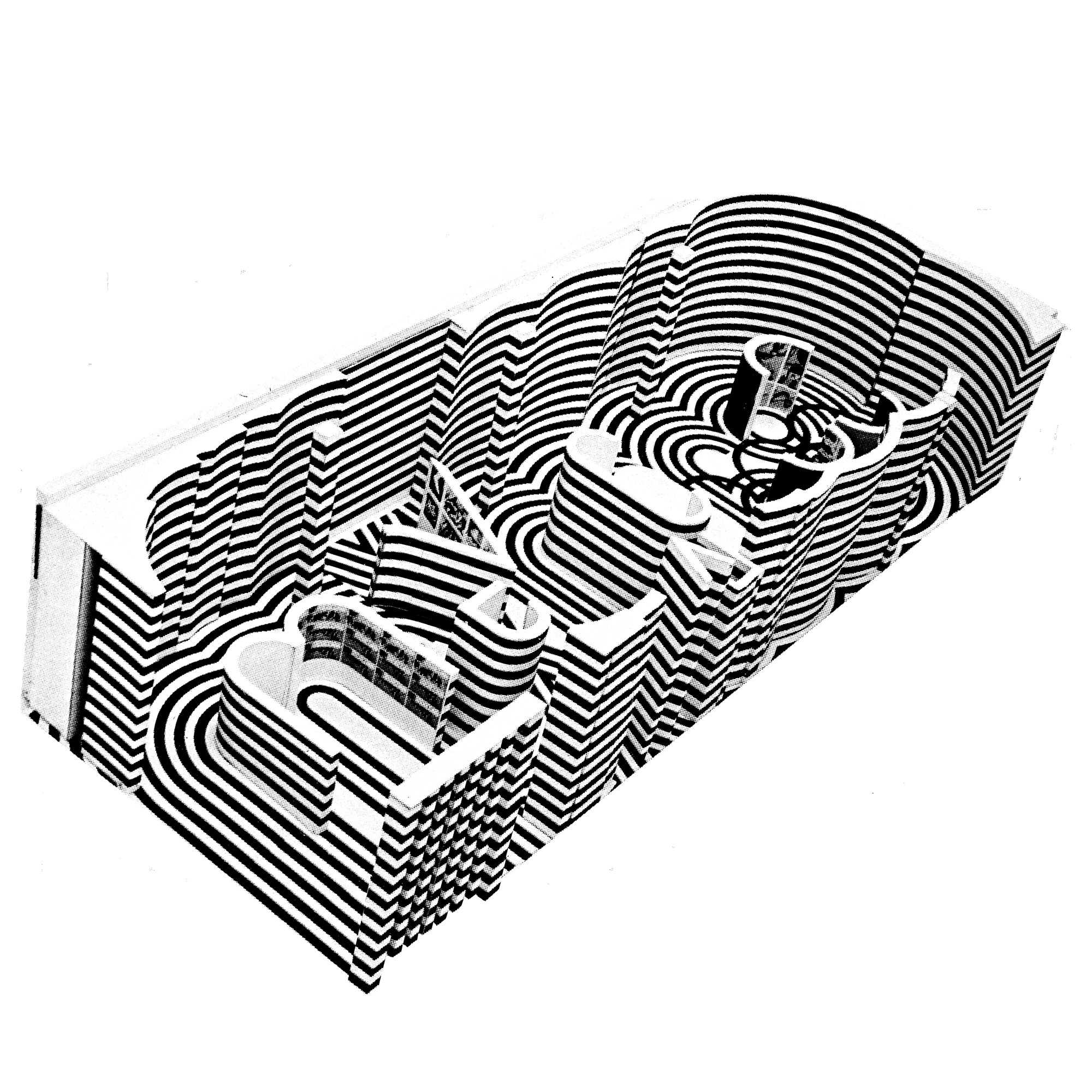
Immersive room installation designed by Lance Wyman and Eduardo Terrazas for the 1968 Milan Triennial
LW: As designers we are often asked to shape our surroundings. Looking back on my Olympic experience, I was tasked with visually presenting Mexico and the Games in an appropriate and positive way. The student uprising was unexpected and grave. Even now, an accurate history is still being sorted out. And I still have my strong feelings. After the Olympics I went on to design many visual systems, quite a few of which were in Mexico. At the moment, I’m very excited to say that we are preparing material for a retrospective exhibition of my work at MUAC, the museum of contemporary art at UNAM in Mexico City. It’s an honor and a privilege to be able to return to Mexico to show the work and tell my stories.
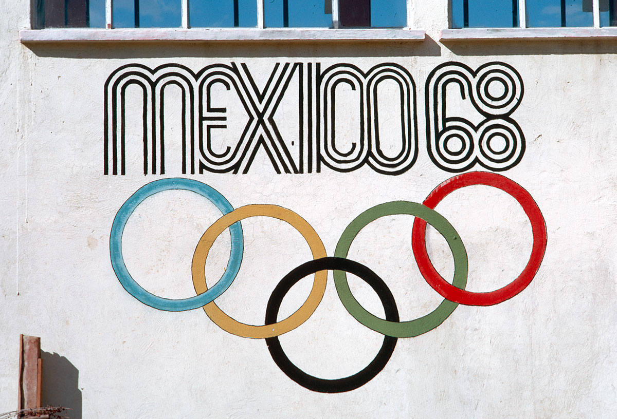
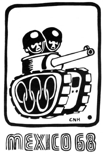
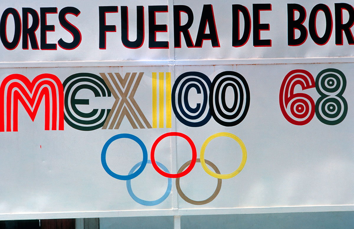
Above and below: some unauthorized uses of the 1968 Olympic identity around Mexico City, collected by Lance Wyman
Further reading:
• A behind-the-scenes article on the massive publication program of the 1968 Olympics
• A paper dissecting the Mexico City student protests
• A large collection of 1968 Olympics identity imagery
• A group interview with Alfonso Soto Sorio, Pedro Ramirez Vazquez, Eduardo Terrazas about the identity and the Huichol influence (extract)
• Contested Games: Mexico City’s Olympic Design Revolution, anexhibition exploring the 1968 Olympics identity and student protest imagery
• A text supporting Contested Games that includes a a detailed description of the student protest graphics (requires free login)
• The declassified NSA papers on the massacre
• A collaboration between the Museum Tamayo and the New Museum exploring issues surrounding Tlatelolco as a cultural site
• A paper exploring the architecture and design of the Olympics, and their relationship with the massacre (requires free login)
• An article explaining the framework of The Age of Discrepancies, an exhibition about Mexican contemporary art between 1968 and 1997
• The blog post “Fragmented”: Mexico ’68 Designer Lance Wyman on Sochi and Olympic Branding Today
March 20, 2014


Comentarios